Lets take it from the topWhere do I even begin? The start seems like a good idea. If you didn't know from the multiple times I have written it in earlier posts, I have already taken art 4 before. I'm glad that I had taken the class before because it gave me a chance to create a couple of good art pieces to use in my portfolio and to get an idea what to expect in workload for the AP class. I only knew of two people that would be taking AP art this year and it turns out that both of them didn't even have art 4 first period. I was so nervous that I wasn't going to know anybody and I wouldn't know where to sit. Thank goodness there were quite a few people that I knew, and I'm even happier that Mrs. Rossi assigned seats.
It took a couple days for everyone to warm up to each other and be able to talk to anyone about each other's art, but as soon as we did I felt a click. I knew that all the other kids in my class were talented and that they would push me to make my best art and be willing to give me helpful suggestions/ criticisms. I can say without a doubt that my first period is my absolute favorite class of the day, and it's not just because of the art. I'm so sad about the kids that aren't continuing to take AP next semester they are so awesome and talented and really should be taking AP. DON'T THINK Y'ALL WONT BE MISSED! Moving on to the actual art reflection of the post. None of the projects surprised me, but having done them all before helped me figure out what worked and what didn't. Probably my favorite piece of the semester was my first piece, the reflections project. If you still didn't know, I love to jump rope, but I didn't want to make all of my pieces related to that. Last year my reflection's piece was crystals I had won at a competition reflecting some of my jump ropes. That piece was a literal and symbolic rendition of reflection. I had never drawn glass before and had only used prismacolor pencils only one time before, so I think it was a little too ambitious. Learning my lesson from that piece I wanted to keep it simple enough, but mostly symbolic. Over the summer I had started to play around with prismacolors on toned paper, and I quickly grew to love it and never want use any other paper for colored pencils. I choose to reflect my love for hockey with a picture of hockey gear and a jersey of my favorite team. Starting the new school year definitely kept me motivated to finish this project and not rush through it. I hate to admit it, but the two mediums that I thought I would hate are probably my favorite now, prismacolor pencils and oil paints. Which brings me to my other favorite piece of the semester, the oil painted apples. I know, I know so many apples will I ever get away from them? The answer is no, they just happen to show up everywhere. I love the way that oils blend. I am prone to make many mistakes, especially when I paint, and oil paints help me hide them a lot better. As the semester went by I noticed that the ideas and compositions of pieces that I wasn't as thrilled about or were on the fence were the pieces I tended to do a lot better. For example, my self portrait. I'm not a big fan of selfies let alone them having dramatic lighting or an interesting angle. After playing around with the colors of the pictures and the compositions, Mrs. Rossi picked the one I liked the least. For starters I don't like self-portraits and two; I don't like the color pink, but guess what the majority of the piece was going to be: pink. Even with all the dread and dislike for the composition, the piece ended up being one of the best pieces I had done this semester. It's not my favorite, but clearly it's Mrs. Rossi's since it's the highest grade I had ever gotten in her class :). Same with this concentration idea of ... the art of canning (food), not what I wanted to do, but I like the piece more than other concentration idea's piece. I learned some new mediums of art, some I liked some not so much. I love watercolor since it's easy to manipulate, but turns out I really don't like gouache. On the other hand I learned I really like scratch board. My interior spaces was done in gouache originally, but I disliked it so much I went over the entire piece with watercolor pencils and markers. Safe to say that wasn't my best piece. Another epic fail of mine this semester was my terrible time management during the weeks around Thanksgiving. I'm not sure how it happened, but I was supposed to finish my landscape and pet portrait before Thanksgiving and that never happened. I managed to get the dog done shortly after Thanksgiving, but the landscape was a different story. I wanted to do it in oil so I knew where ever I started it would most likely be where I painted all of it. This is where it all went in a downhill spiral. I started to move onto the next piece at school while painting the landscape at home. The issue I ran into was that Mrs. Rossi wanted to see the piece in person but my painting was so wet I would have to wait for it dry to take it in, and vice versa going from school to home. I quickly realized I needed to get things back on track and my plan for next semester is to manage my time better. I feel like I have made this reflection one giant rant, so I'll just wrap this up. I think I have really improved as an artist over the last few years. I feel like if you look at my current pieces this semester that isn't so easy to see, but having taken the same class twice I was able to tell. I got a kick at looking at the difference in my oil painting practices that were a year apart. It's easy to see that I have improved over the past year. I know that my compositions are very different from the ones last year but I like that I can tell that the way I have interpreted things have changed as well. I'm excited for the next semester to come and see what art I have in store. I can't thank Mrs. Rossi enough for all her patience with me and helping me grow as an artist. Alright this rant is finally over!
0 Comments
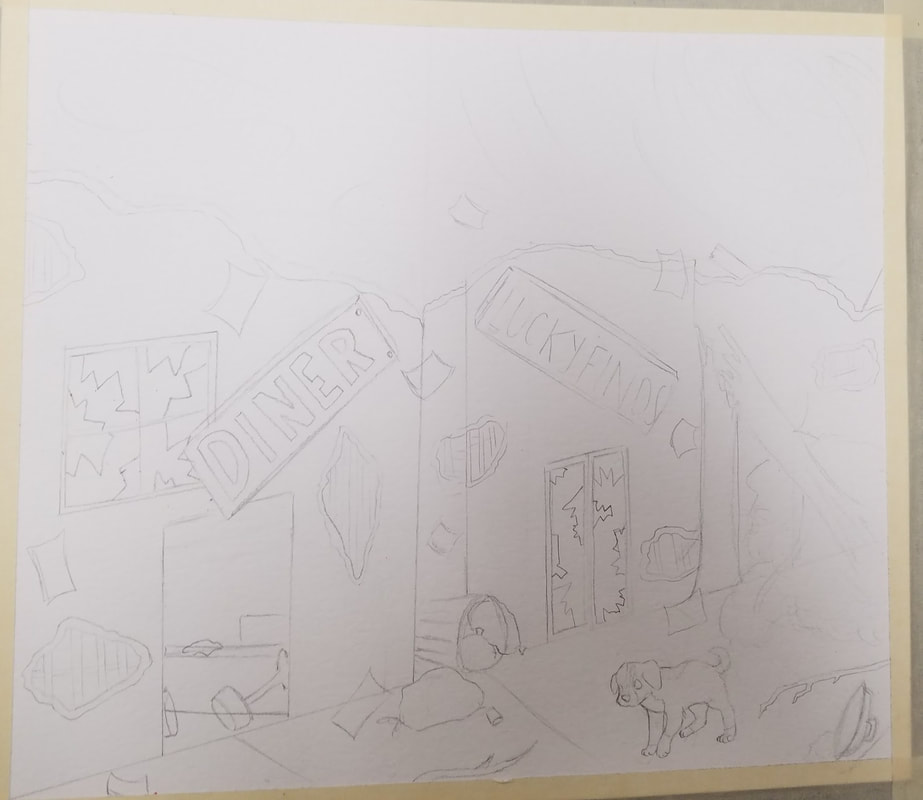
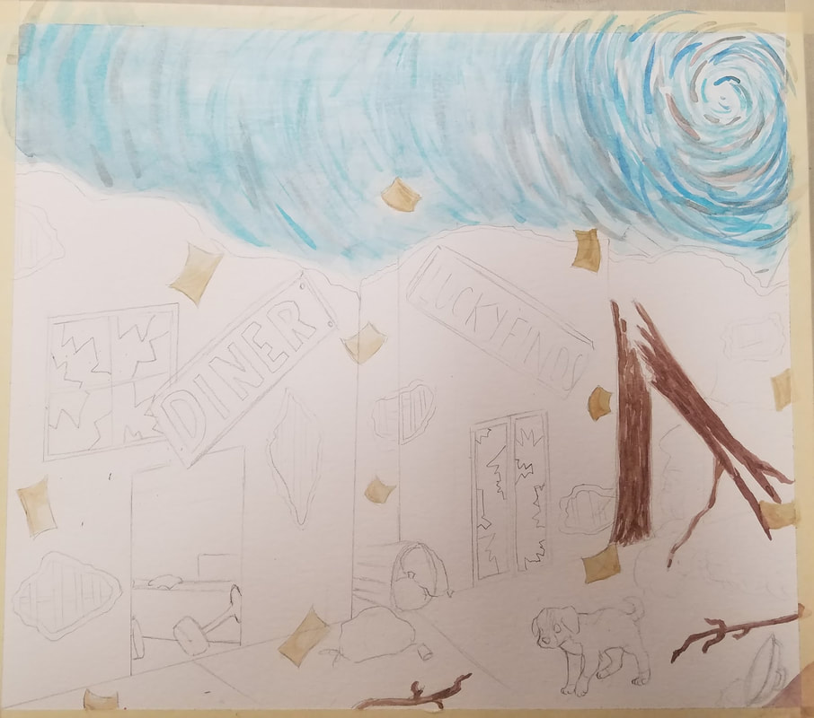
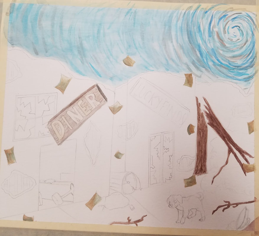
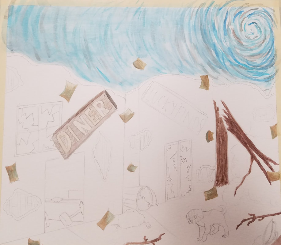
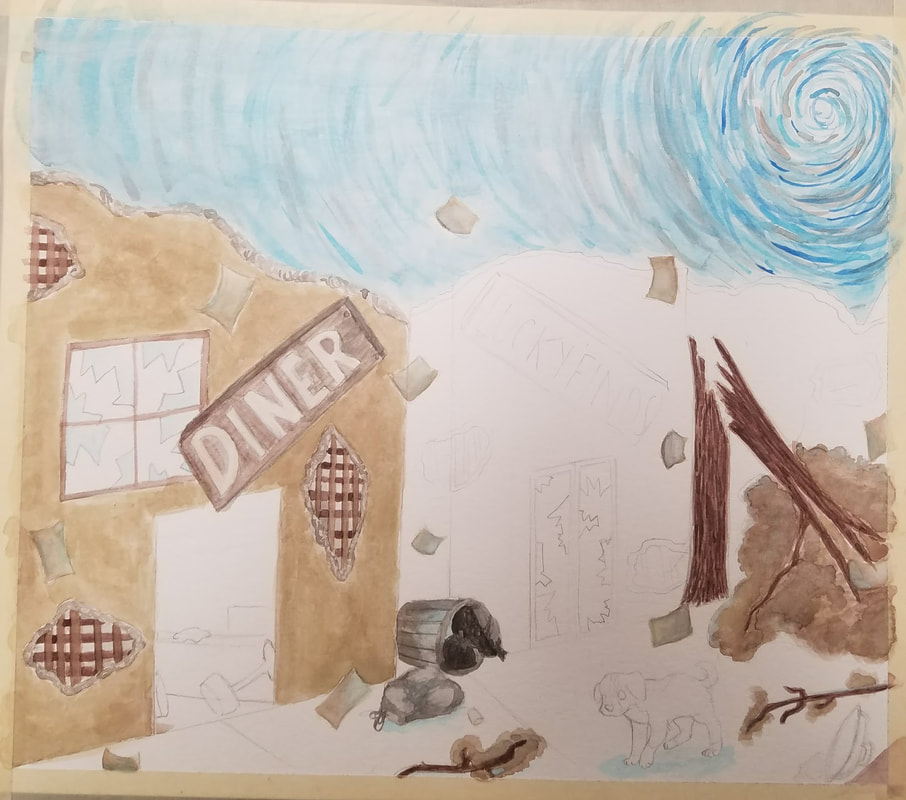
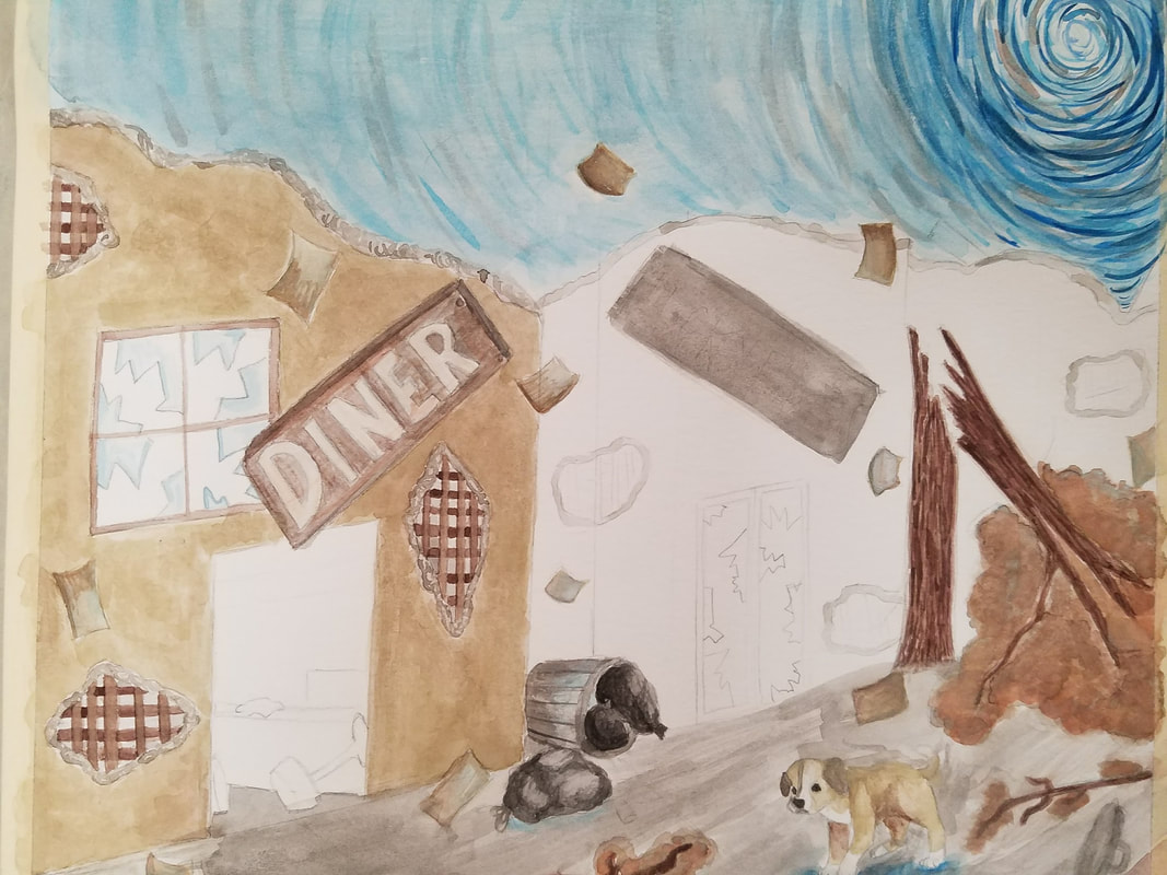
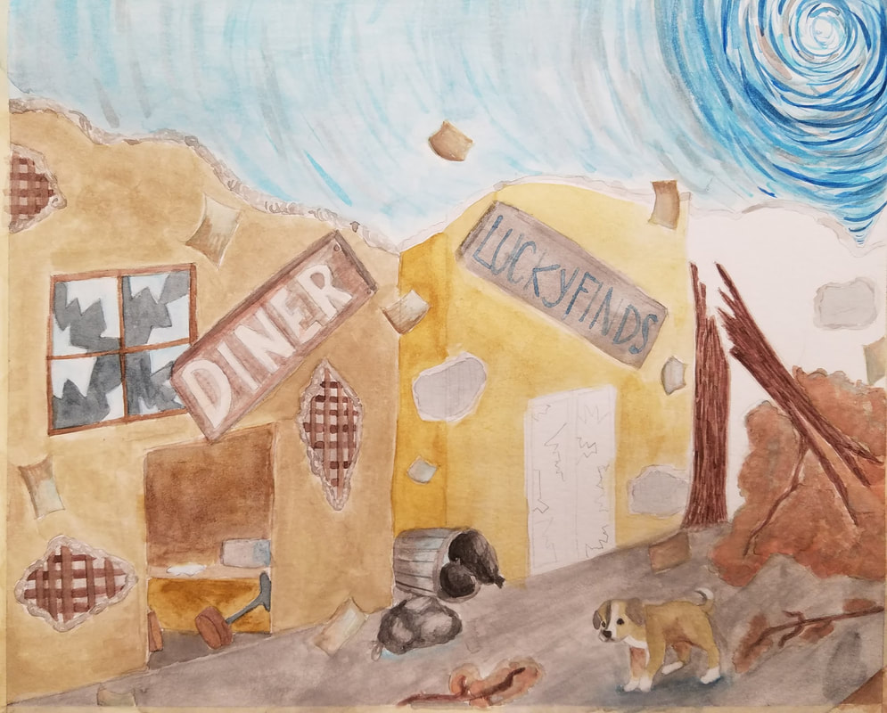
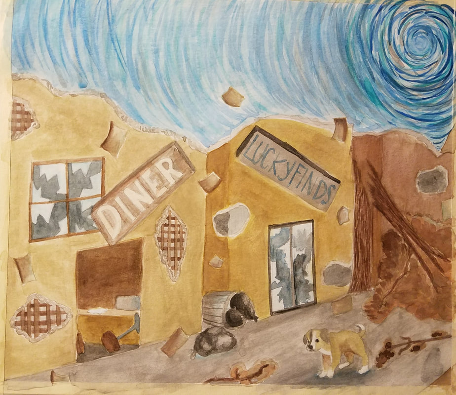
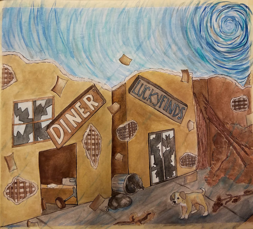
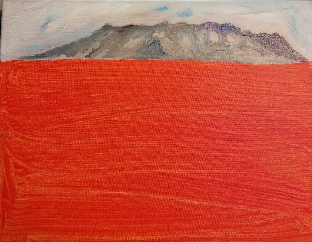
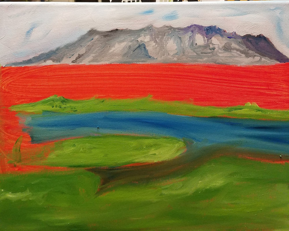
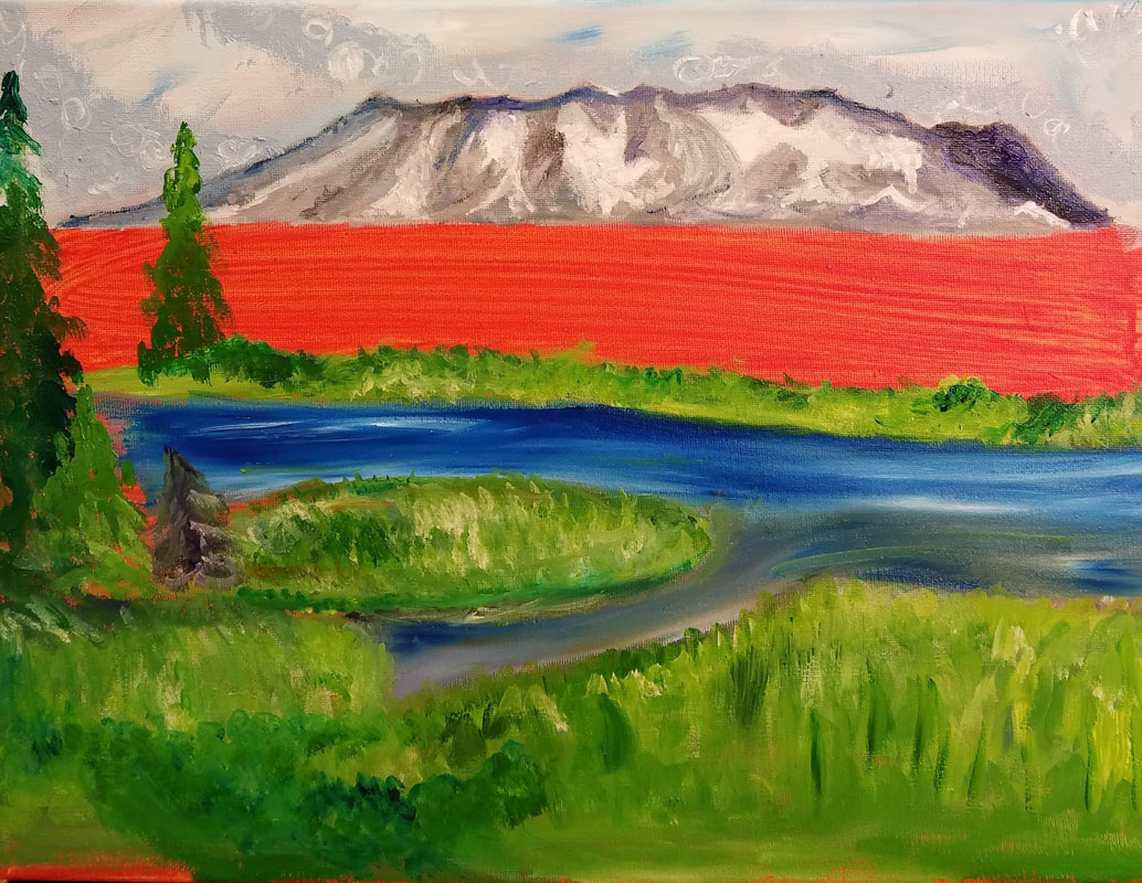
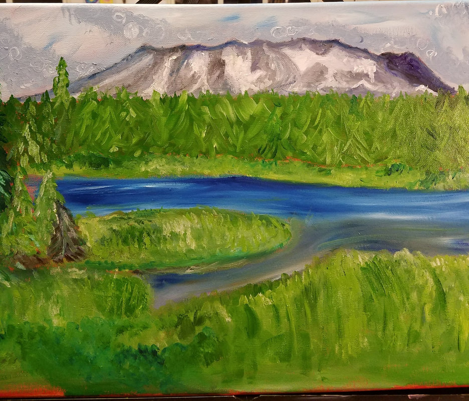
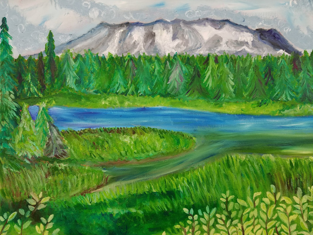
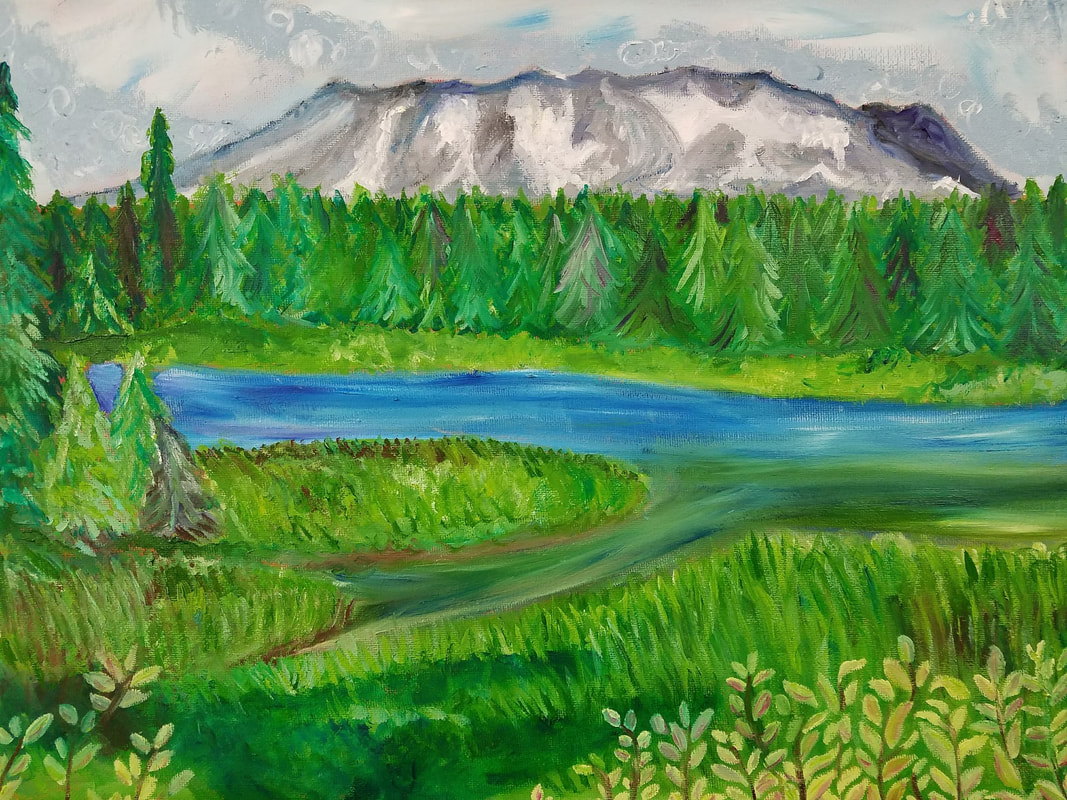
I'm a RebelYeah, so I was supposed to do the project nature turns mechanical, but I have already done that and I didn't like it one bit. I decided that I wasn't going to bother with doing the project at all this time. Instead I thought since I can't pick which concentration I wanted to I'll do one project from each. One of my ideas was telling the story of my dogs life. She is a hurricane Katrina puppy so I wanted to tell they story from there. The only issue I had is that she is a rescue puppy so she came in a truck to a local pet rescue so I never saw where she was. I know that she probably wasn't all by herself since she had a sister but I had an idea to convey a specific mood in the piece with the composition and color choice. Going to back to me not knowing where she came from means I don't have any reference pictures of her. This piece was going to be made by compiling a whole bunch of pictures together to get the composition I want. I had an idea of having my dog in a deserted street that is completely destroyed by hurricane Katrina. I did quite a few rough sketches to get an idea what this might look like, then I thought it would look good if she was sitting on a boat in a flooded street, but the angle I drew I didn't like and then scraped the whole idea instead. ProgressSince I didn't have any reference pictures I knew the piece was going to be more cartoon like than realistic. I didn't mention earlier in the post but I knew I wanted to do a watercolor piece so I based the project off the look of the watercolors. As I was fooling around with the sketch of the hurricane and the puppy I played around with different shades of brown and blue. I liked the color combo, so I thought I would limit my palette to blues, browns, and grays. By doing this I was hoping to create a tone of sadness/blueness if you will; to show the harshness of hurricane Katrina. Like the landscape project, this one fell into an awkward time period so it took a while to find times to work on the piece. I liked the initial sketch I had on the paper because it was more realistic. As I started painting I quickly learned how terrible the watercolors I was using were. Unlike the pieces I had done in the past with the watercolors I was looking for darker and solid colors since I wanted to embrace the cartoon look. That's when I noticed the chalkyness of watercolors and all the brushstrokes on the paper. This frustrated me and caused me to become reluctant to finishing the project. I decided to fill in the areas with solid colors rather than trying to add texture with harsher shadows. I still didn't like the way the piece was turning out, so I added the black lines to make things stand out more. The outlines made me like the piece better and help the piece come together. PlanningI went to Seattle the summer between my freshman and sophomore year and went hiking at Mt. Rainier. I thought the mountain was absolutely beautiful and wanted to draw one of the pictures I took for my landscape last year. Somehow I didn't end up doing the mountains last year, so I thought now was a good time to revisit my pictures. I had Mrs. Rossi go through all the pictures I had and she narrowed it down to a few for me to choose from. I didn't think about the medium too much that I was going to use. Somehow, I don't know how Mrs. Rossi did it, but she got me to really like oil paints so if am going to paint on a canvas it's gonna be oil. 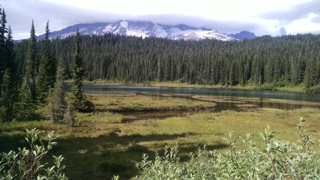 ProgressSo, this piece kinda fell out of my mind very often. This time every year I start to get a little behind with all my work with all the holiday breaks and testing going on. I meant to paint this over thanksgiving break but that never happened. Once we got back from break we had to move on to the next project. As I moved on the next project I started this one at home. I decided I was going to try another technique of oil painting when doing this project. I wanted to lay down some base colors for each section and then add the details after that first layer dried. That idea didn't end up working out the way I planned and all my greens looked the same. The next problem I ran into with this piece is when Mrs. Rossi wanted to see it. I would go a week or so without painting the piece since I wanted the first layer to dry and then Mrs. Rossi wanted the piece at school so she could see it. If I ended up painting some of it at school then I had to keep it there till it was dry again and drag all of my other project home. The painting of this piece didn't take a long time but finding the time to paint it was the hardest part. Final Overall I really like this piece, I like all the colors and how the go together. In the reference picture there is a whole lot more detail and normally I am one for detail, but I like more simplicity in my oil paintings. My landscape from last year actually was an oil paint as well and that time was only my second time using oil paints. I really struggle with brown tones and paint, not sure why I just do. My goal for this piece was to make it a redemption from my last landscape. To do this I tried to simplify the shapes to capture the essence of the picture without all of the detail. I feel like I did a pretty good job with that since the color of the mountain is so drastic from the rest of the piece it makes it stand out like it does in the reference picture. To redeem myself with the browns I pushed my self to add browns for the shading of the green areas even though there wasn't brown in the ref picture. I love the mountain itself the most, I like the shape the different shades used and the snow in it. The purple was a good idea for the shading since the background is blue. I do like the trees as well. What I could do better is the water. The water in the picture is flatter and browner, but I didn't want it to blend so much with the trees and grass. I think I could do a better job blending the water to the grass so the ground doesn't so flat. Other than that I really like how the piece turned out.
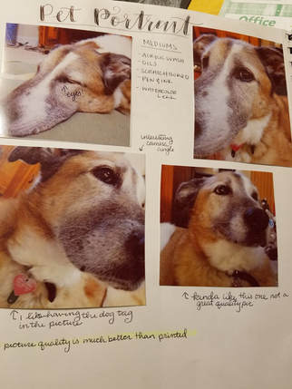
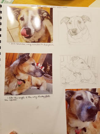
PlanningI LOVE MY DOG SOOOOOO MUCH!!!! Since I love my dog so much it makes me so happy to do her portrait, but nervous at the same time. It makes me nervous because what if the piece doesn't come out well, like it would upset me so much that I couldn't make a good portrait of her. Planning for this piece wasn't hard when finding pictures, but it took a lot of photos and sketches to pick the one I liked the most.
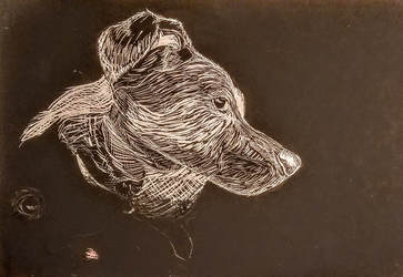
After sketching, I finally decided on doing the one where its a side profile of her on her dog bed. Next thing to decide was the medium I was going to do the portrait in. Last year I had done this project in prismacolor and I liked but I wanted to do something different and besides the project before this I had done in prismacolor. Another girl in the class mentioned that I should do it as a scratch board, but I had never done scratch board before. Mrs Rossi gave a scrap piece to practice, and I quickly learned that I needed to make smaller and thinner lines. Mrs. Rossi suggested that I use a white color pencil on black paper. I think that really helped me define the areas of my dog that needed the whitest shade and even how to create more value in the fur.
ProgressOh boy, this piece took a very long time to complete. The first issue I had was drawing the outline onto the board in proper proportions. Finally I got some transfer paper and copied the image over and filled in a few missing spaces. I thought it would be a good idea to start with the really white part of the piece of her head and work out from there. My major concern was going to scratch too much off and flatten the piece. This piece never bothered, or bored me, rather it felt therapeutic as long as I couldn't hear the scratching noise. As for the background I wanted it to be semi-detailed, but I didn't want it to have the same texture as Lucky. I used loose cross hatching lines to draw out the background, but in some areas I scratched out the shadows rather than the highlights. Overall I really like this piece I love the texture and realism that I achieved. I like the color choice of black and white scratch board. Things I didn't like so much is that you can't really tell that my dog has multiple colors like dark and golden brown as well as white and black, you can see the difference in shades, but not enough to imagine different colors.
PlanningWell, I am not one for taking pictures of myself let alone drawing or painting myself. I did not enjoy my self portrait from last year at all, and FUN FACT: Even though I did a portrait last year, I NEVER learned how to draw people. Besides that, I had like 20 pictures of me that I thought would be good to to use. Turns out I was wrong, Mrs. Rossi didn't like ANY of them! That just added on to the pile of hate this project was gonna be, I didn't want to go and take more pictures. After I took some new pictures I played around in Photoshop with the colors. The colors that looked the best were pinks, reds, purples, and yellows. Again adding to the pile of hate, I don't like pink and that would be the majority of the piece. ProgressSince I have never been taught how to draw a self portrait Mrs. Rossi suggested that I grid out my paper to keep the proportions correct. Once I grided out my paper and drew the line work, it was time to start coloring. I decided that it would be easier if I worked left to right and not start with the face or a specific feature. I know the kind of style that I have when using prismacolor pencils isn't quite the smoothest or completely blended look. When looking at the picture my face is rather smooth, so I was worried that I wouldn't get texture right. I'm glad the hair is what was draw first I love the way the hair came out. I like the way the transition of colors look, and the highlights in the hair. I give any of my talent of hair to Nicole from last year, she made it so easy to understand drawing hair. With the skin I decided to light layers of color blocking since the reference picture was pretty much color blocked. I liked the colors I used for the face, I just wish they blended better together. I don't like the lines you can see from the pencil strokes. I used the colorless blender to smooth some things out a bit more. Overall I like the piece a whole lot more than the one I did last year, but I still don't really love the texture of the piece.
Back at the BarnI am doing the inside of the barn that my Great Aunt keeps her horse, Gambler, at. A lot of happy memories for me are with my Aunt and the barn, not particularly the one I am going to paint, but the barns where Gambler stays. She sent me a ton of pictures it was almost too hard to choose. I decided to use a medium that I had never used before, gouache. It seems like watercolor but doesn't blend together easily. As I worked on this project, the more I realized I didn't like gouache. The StruggleThis whole project has been a struggle even this post. I had a really good summary of my process and weebly just deleted it. Oh well, I struggled with the type of paper to use because the watercolor paper I was experimenting with didn't hold a lot of the gouache well. I ended up using mix media paper and it worked very well. I struggled with the perspective of the piece and in the end I still don't think I got it right. As I mentioned before it turns out I HATE GOUACHE!!!! I tried several different techniques and didn't like any of them. I wanted to see the detail of the wood, but the gouache made everything smooth and flat. I knew I had to make the most out of a bad situation so I opted to use watercolor markers and pencils for the details of the piece. Since I had pretty much color blocked with the gouache I used the markers to make harsher lines to then be covered with more detail. Before using the markers the piece looked soft, but not in a good way. Soft as in the piece melted into itself and I couldn't quite make out the shapes. The brightness of the markers helped me highlight the parts of the piece I wanted to focus on. After that I went in with the watercolor pencils and did the finer details in the wood and the buckets. The more detail I got into the piece the more I liked it. Overall I wouldn't call this my worst piece, but I wouldn't call it my best piece either. I think I could have done better if I wasn't pressed for time to finish this project. If I were to do the project again I would not use gouache, and I would spend more time making sure the perspectives are right. My favorite thing about the piece has to be the color choice. I feel like I did a good job picking out the colors for the project and nothing is too extreme or seems like it doesn't belong. I think the piece could be revisited later, but for now I'm done 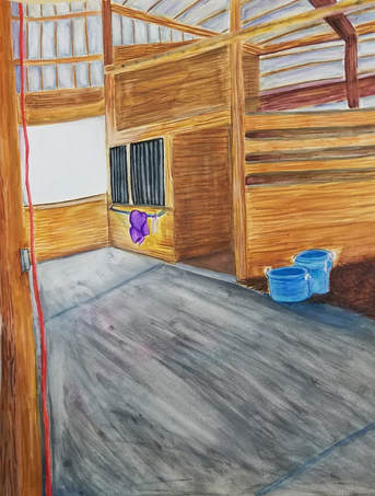 Sky Top Orchard - Buckets of ApplesI know I said I didn't want to do apples again in my last post, but this is different, this is a ton of apples in one picture. Honestly the planning for this piece kinda sucked since Mrs. Rossi saw the apples on my phone and said, "that is what you are doing." Apple picking holds a very special place in my heart, since it has now become a family tradition. Apple picking is always a happy memory in my mind, and it makes me think of apple pies and apple butter. The object of the piece is the apples in the buckets, the rest is to make me feel like I am in Sky Top Orchard. Since I wanted that comforting scene of the Orchard, I stuck with the natural colors of the picture. Besides, I'm not really one for unique colors. I started the piece with a burnt sienna wash that was a bit on the lighter side. I then went and sketched the objects with a pencil. Finally time to get started. I noticed in the picture the texture of the apples and the wide range of colors that make up each apple. I didn't want the entire piece to have smooth strokes, and the apples had so many colors I decided to leave the strokes visible in apples. I took a lot of time and a ton of colors with the first apple, arguably its one of the best ones of the entire piece, but as the more apples went by the less time I spent on them. As I was going with the green and the red apples, I was filling in the void areas with a dark blue. I would later go over those spots with some dark red to tie the void back to the apples. I don't know why, but I just don't really like using browns with oil paints....really just don't. I ended up straying a bit from the picture with the actual shades of brown I used for the buckets. I got a bit frustrated when I kept blending the color streaks of the wooden bucket too much. Eventually I left it to dry and started again. As for the wagon hat is a whole other story. When looking at the reference picture most of it is shades of green. I wanted the wagon to stand out from the apples and even the background. To achieve this I added a lot more shades of blue to the wagon and tried to not blend the colors too much, but keep it smooth. I added accents of white with blended into the highlights of the wagon I wanted. I did end up painting the back ground twice, the first time was rather flat and blended too much the wagon. I decided to add shades of purple, brown, and yellow to darken up the background and make it more abstract. I really am happy with the outcome of this piece. Final ReflectionsI really love this piece I makes me feel like I am there in the Mountains picking apples with my family. I think I did a good job with the use of multiple colors in the apples, but making them still feel like they all belong there. I like the wagon itself as well, there is something that drags me eyes to it. I feel like I could have done the wood and the background better, but my patience had run a little thin by then. In the end I still love the piece, If I were to redo this piece I would push my shadows more and attempt to show more depth inside the buckets, rather than just apples sitting in seemingly in mid air.
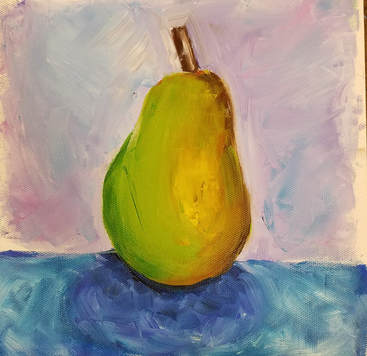
Round 2 Since I had taken art 4 before, I had already been taught how to use oil paints. Even so, I am not the only person in the class and many of the other student's did not know how to use oil paints. I am glad that I still did the practice oil paintings because it had been a really long time since I last used oils and I needed to warm up. Last year I had painted apples, so the plan was to do other fruit/vegetables. For the oil painting using just brushes I did a pear. I tried to color block, but the pear I had chosen didn't color block well. I got a little frustrated with the pear and I ended up being a little muddy and lacking texture. I liked the background a whole lot though, I liked the look of the brushstrokes and the multiple colors used in the background. Here is the pear from now compared to the apple from last year. I learned not to blend too much with the colors, and to not be shy and use more paint.
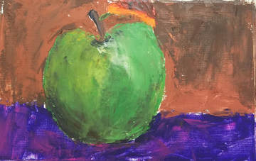
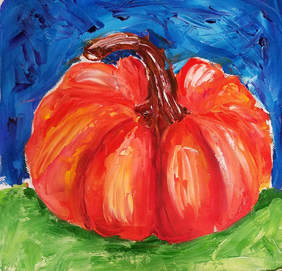
Oh the palette knife, if you know me, then you know I don't like palette knife paintings. I feel like I have no control on where the paint goes and any potential blending. I love the texture of palette knifes, I just don't like the feeling of using one. My old palette knife painting was an apple, I would barely call it an apple. I quickly muddied up the canvas and for whatever reason my mind was like, "yeah, brown, that's a good idea to use for the background, and oh while you are at it make the leaf orange." As for the pumpkin I painted now it looks so much better than the last time I used a palette knife. Don't get me wrong I do like the pumpkin, but I still didn't like painting with the palette knife.
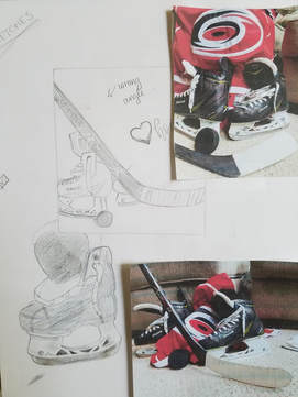
Planning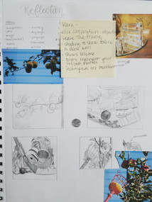 So, I have taken Art 4 before, so most of the projects in the class I will be doing again. The reflections project would definitely be one of those I am doing again. My project last year was reflecting the biggest part of me : jump rope. Since that had a bigger personality reflection I wanted this years to be a more reflective composition physically. I started off by looking at some of my unused ideas from last year, good thing I didn't do any of them because they kinda sucked. After just listing some items I thought reflected me I came up with 10 ideas (sorry I covered them up with critique notes). I managed to narrow it down 2 ideas. My family goes apple picking every year, and I feel like its a big part of my life, so I tried to draw different compositions of that. After borrowing my friends hockey gear to take the other picture I knew I was going to like this composition more. I love hockey, my friend that I borrowed the hockey gear from has played hockey for as long as I have known him. I grew up playing hockey with him and watching hockey games. Hockey one of the very few sports that I can tolerate watching and actually enjoy watching. After I did my first 4 compositional sketches I did a few more detailed drawings of the hockey gear to see what I liked and to plan my colors.
ProcessFinal Thoughts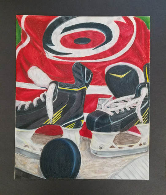 Even though I planned on doing a more physical reflective piece, I ended up doing more of a personality reflective piece. When I look back over my projects with prismacolors each one gets a bit better. I love how this project turned out. I think the successes of the piece are the hockey puck and the fabric. I had a lot of black in the the objects in the composition and I didn't want to use the black pencil. I am really proud of the hockey puck, not once did I use the black pencil in there. I did use a bit of black in the skates though. I have never done fabric before, let alone trying to draw fabric in color. I decided to do a rather thin layer of color blocking first so I could see the lights and the darks. Then I would go back and forth using the medium color and going back over with that light or dark color. Even when you look at the original picture, you don't see a lot of different shades of red in the jersey. I really love the fabric, and since I had never done fabric before I was very surprised on how it turned out. As for the not as successful part of my piece, it would be the carpet. I thought about doing wood instead, but I thought that would be just as hard to draw. I tried to keep the carpet lines as freeform and blurry as possible to make it look more fluffy. The more I tried to add to the carpet, the worse I thought it look. Carpet is hard. If there was something I would change about the piece it would be for sure the carpet.
Philosophy of Art; what is it? Such a seemingly simple question, yet has a large spectrum of answers. Art probably has a dictionary definition on google, but it never had crossed my mine to ever look it up. Like most people, I believe when you hear the word art the definition pops into your head instantly. No one really takes the time to define it, they just see something someone once labeled to them as art. Its like asking why we have the alphabet, and what the letters are, and who was like these are all we need. They just are, there isn't real good explanation.
What is art to me? Art isn't a picture, or a painting, or a sculpture. To me it is something that conveys and idea or feeling or tells a story, when looked at. Art is something that makes me stop and take a moment to enjoy and interpret it. Art is something that speaks without actual talking. Art is the ability to share your thoughts, feelings, ideas, and stories with others through a creative outlet. Art allows you to express yourself without fear of what other people think. Art is more than what I can begin to think of. Ask me again at the end of the year I'm sure a lot will have changed. |
AuthorWrite something about yourself. No need to be fancy, just an overview. Archives
January 2018
Categories |
 RSS Feed
