Back at the BarnI am doing the inside of the barn that my Great Aunt keeps her horse, Gambler, at. A lot of happy memories for me are with my Aunt and the barn, not particularly the one I am going to paint, but the barns where Gambler stays. She sent me a ton of pictures it was almost too hard to choose. I decided to use a medium that I had never used before, gouache. It seems like watercolor but doesn't blend together easily. As I worked on this project, the more I realized I didn't like gouache. The StruggleThis whole project has been a struggle even this post. I had a really good summary of my process and weebly just deleted it. Oh well, I struggled with the type of paper to use because the watercolor paper I was experimenting with didn't hold a lot of the gouache well. I ended up using mix media paper and it worked very well. I struggled with the perspective of the piece and in the end I still don't think I got it right. As I mentioned before it turns out I HATE GOUACHE!!!! I tried several different techniques and didn't like any of them. I wanted to see the detail of the wood, but the gouache made everything smooth and flat. I knew I had to make the most out of a bad situation so I opted to use watercolor markers and pencils for the details of the piece. Since I had pretty much color blocked with the gouache I used the markers to make harsher lines to then be covered with more detail. Before using the markers the piece looked soft, but not in a good way. Soft as in the piece melted into itself and I couldn't quite make out the shapes. The brightness of the markers helped me highlight the parts of the piece I wanted to focus on. After that I went in with the watercolor pencils and did the finer details in the wood and the buckets. The more detail I got into the piece the more I liked it. Overall I wouldn't call this my worst piece, but I wouldn't call it my best piece either. I think I could have done better if I wasn't pressed for time to finish this project. If I were to do the project again I would not use gouache, and I would spend more time making sure the perspectives are right. My favorite thing about the piece has to be the color choice. I feel like I did a good job picking out the colors for the project and nothing is too extreme or seems like it doesn't belong. I think the piece could be revisited later, but for now I'm done 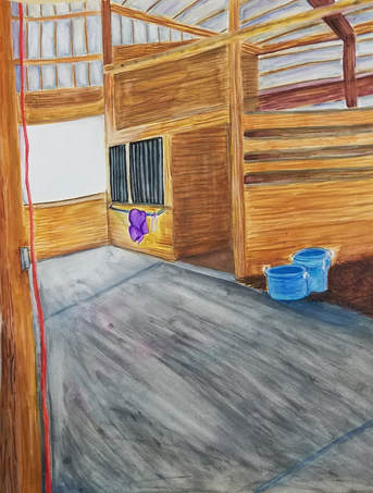
0 Comments
Sky Top Orchard - Buckets of ApplesI know I said I didn't want to do apples again in my last post, but this is different, this is a ton of apples in one picture. Honestly the planning for this piece kinda sucked since Mrs. Rossi saw the apples on my phone and said, "that is what you are doing." Apple picking holds a very special place in my heart, since it has now become a family tradition. Apple picking is always a happy memory in my mind, and it makes me think of apple pies and apple butter. The object of the piece is the apples in the buckets, the rest is to make me feel like I am in Sky Top Orchard. Since I wanted that comforting scene of the Orchard, I stuck with the natural colors of the picture. Besides, I'm not really one for unique colors. I started the piece with a burnt sienna wash that was a bit on the lighter side. I then went and sketched the objects with a pencil. Finally time to get started. I noticed in the picture the texture of the apples and the wide range of colors that make up each apple. I didn't want the entire piece to have smooth strokes, and the apples had so many colors I decided to leave the strokes visible in apples. I took a lot of time and a ton of colors with the first apple, arguably its one of the best ones of the entire piece, but as the more apples went by the less time I spent on them. As I was going with the green and the red apples, I was filling in the void areas with a dark blue. I would later go over those spots with some dark red to tie the void back to the apples. I don't know why, but I just don't really like using browns with oil paints....really just don't. I ended up straying a bit from the picture with the actual shades of brown I used for the buckets. I got a bit frustrated when I kept blending the color streaks of the wooden bucket too much. Eventually I left it to dry and started again. As for the wagon hat is a whole other story. When looking at the reference picture most of it is shades of green. I wanted the wagon to stand out from the apples and even the background. To achieve this I added a lot more shades of blue to the wagon and tried to not blend the colors too much, but keep it smooth. I added accents of white with blended into the highlights of the wagon I wanted. I did end up painting the back ground twice, the first time was rather flat and blended too much the wagon. I decided to add shades of purple, brown, and yellow to darken up the background and make it more abstract. I really am happy with the outcome of this piece. Final ReflectionsI really love this piece I makes me feel like I am there in the Mountains picking apples with my family. I think I did a good job with the use of multiple colors in the apples, but making them still feel like they all belong there. I like the wagon itself as well, there is something that drags me eyes to it. I feel like I could have done the wood and the background better, but my patience had run a little thin by then. In the end I still love the piece, If I were to redo this piece I would push my shadows more and attempt to show more depth inside the buckets, rather than just apples sitting in seemingly in mid air.
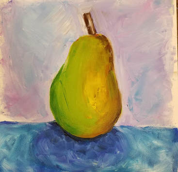
Round 2 Since I had taken art 4 before, I had already been taught how to use oil paints. Even so, I am not the only person in the class and many of the other student's did not know how to use oil paints. I am glad that I still did the practice oil paintings because it had been a really long time since I last used oils and I needed to warm up. Last year I had painted apples, so the plan was to do other fruit/vegetables. For the oil painting using just brushes I did a pear. I tried to color block, but the pear I had chosen didn't color block well. I got a little frustrated with the pear and I ended up being a little muddy and lacking texture. I liked the background a whole lot though, I liked the look of the brushstrokes and the multiple colors used in the background. Here is the pear from now compared to the apple from last year. I learned not to blend too much with the colors, and to not be shy and use more paint.
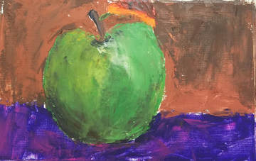
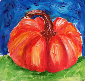
Oh the palette knife, if you know me, then you know I don't like palette knife paintings. I feel like I have no control on where the paint goes and any potential blending. I love the texture of palette knifes, I just don't like the feeling of using one. My old palette knife painting was an apple, I would barely call it an apple. I quickly muddied up the canvas and for whatever reason my mind was like, "yeah, brown, that's a good idea to use for the background, and oh while you are at it make the leaf orange." As for the pumpkin I painted now it looks so much better than the last time I used a palette knife. Don't get me wrong I do like the pumpkin, but I still didn't like painting with the palette knife.
|
AuthorWrite something about yourself. No need to be fancy, just an overview. Archives
January 2018
Categories |
 RSS Feed
